
About IDIO
IDIO is a design agency based in Silicon Valley, specializing in branding, web and UI/UX design, and industrial design.
Design Goal
To better showcase our services and work, we decided to redesign the logo and create a brand-new website that reflects our expertise and creativity.
Redesign the logo
Design and develop the website
Design a visually appealing and intuitive website that clearly showcases idio’s expertise.
Implement micro-interactions and smooth animations to elevate user engagement.
Optimize the information architecture to provide a seamless browsing experience.
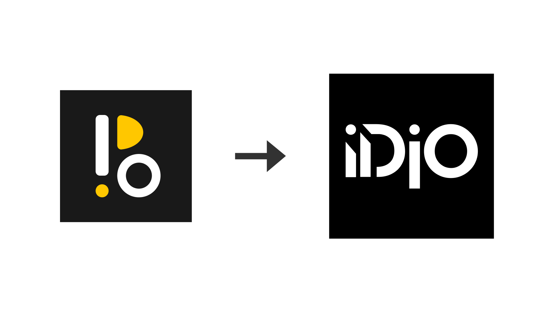
Logo
As part of IDIO's brand upgrade, we designed a new logo that reflects the agency's innovation and professionalism while ensuring strong adaptability.
Old vs New
Past Iterations
After team brainstorming and sketching, we identified several key directions.
Ultimately, we chose a minimalist, modern, and highly recognizable design that adapts seamlessly across various media, including print, social media, and websites.


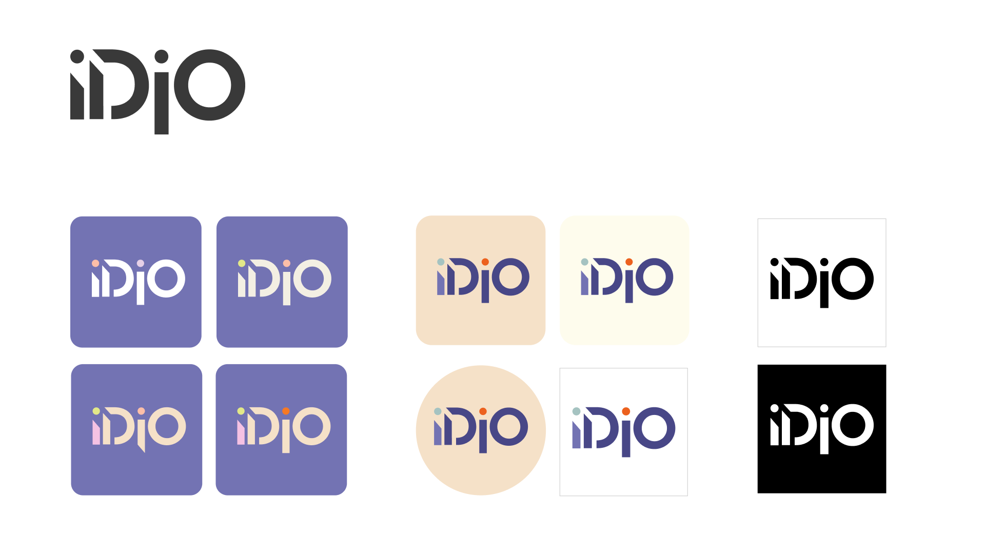
Final Logo
During the website design process, we opted for a black-and-white version of the logo to maintain visual simplicity and minimize distractions.


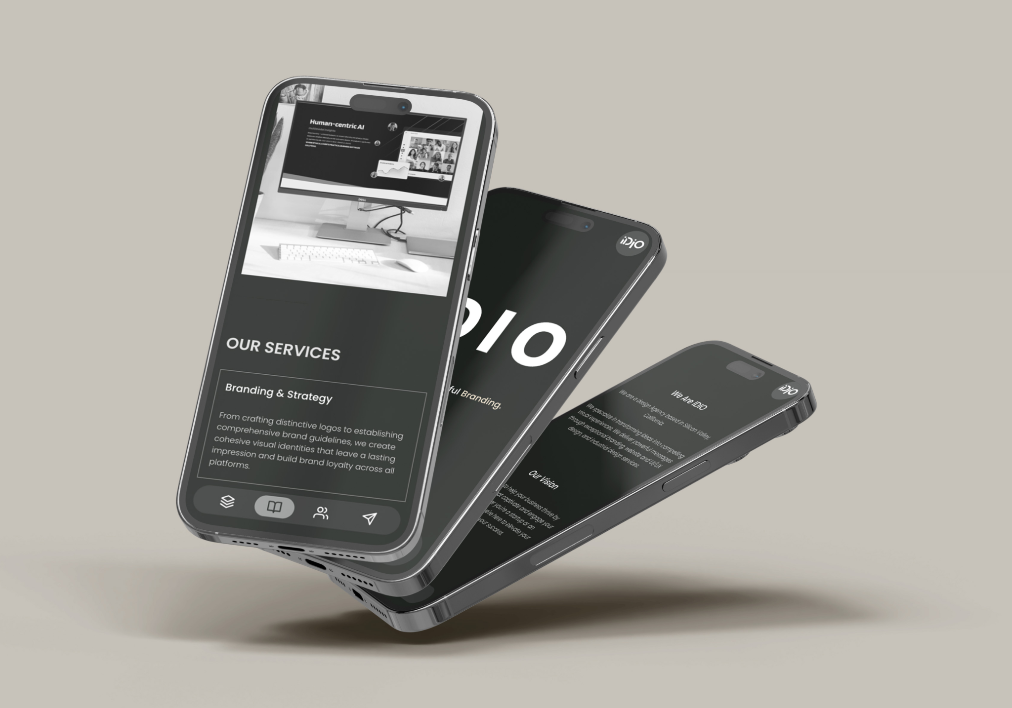
Wesite
Ideating & Sketching
I kicked off the design stage and sketching out low-fidelity concepts with just pen and paper.


Interaction Optimization
Nav Bar - Desktop:
Ensured that users can quickly access core content regardless of their scroll position.
Designed interactions that align with user habits, improving usability and overall experience.

Nav Bar - Mobile:
Fixed at the bottom for easy access.
Replaced text with intuitive icons.
When scrolling down, the navigation bar shrinks to minimize visual distraction.

When designing the website, we aimed to enhance the user experience through smooth interactive animations, making the site more dynamic and immersive. Here are some key interaction designs and their optimizations:
Scrolling Effect:
Adds depth and enhances layering for a more immersive experience.
Ensures fluid content flow and visual engagement.

Pre-load Effect:
Designed a simple yet distinctive loading animation to reinforce brand identity.
Ensured visual consistency during page loading for a smooth user experience.

Dynamic Text:
Enhances brand energy and engagement.
Draws attention to key messages, improving readability and impact.
Ensured text flows naturally across various screen sizes.

Web Design Guidelines

Final Design


- Reflection -
Adapt, problem-solve, and collaborate effectively in a fast-paced design environment.
I learned a lot through this project. It was one of my first times collaborating closely with other designers to bring a website from concept to launch, and I gained valuable experience in team communication, decision-making, and balancing different design perspectives.
This experience reinforced the importance of design feasibility and implementation, ensuring that what we created wasn’t just visually appealing but also technically achievable.
Additionally, I deepened my understanding of interaction design and user experience principles. By testing different scrolling behaviors, pre-load animations, and navigation flows, I was able to see firsthand how small design decisions can significantly impact usability and engagement.